'%3E%3Cpath fill='%233A5C8D' d='M18.08 2H1.93C.87 2 0 2.85 0 3.9v15.5l.22.02c9.75 0 17.7-7.8 17.86-17.42Z' /%3E%3Cpath fill='%233A5C8D' d='M26.33 2H24.2C24.05 14.97 13.35 25.48.22 25.48L0 25.47v2.61C0 29.14.87 30 1.93 30h24.4c1.06 0 1.94-.86 1.94-1.92V3.91c0-1.05-.88-1.9-1.94-1.9Z' /%3E%3Cpath fill='%23262C49' d='M39.27 31.8c-.74-.2-1.28-.74-1.28-1.48 0-.88.67-1.55 1.56-1.55.23 0 .37.03.64.03 1.7 0 2.92-.63 2.92-3.02V10.52c0-1.04.74-1.81 1.8-1.81 1.01 0 1.76.77 1.76 1.81v15.73c0 3.9-2.34 5.75-5.83 5.75a5.1 5.1 0 0 1-1.57-.2Zm8.01-28.87a2.34 2.34 0 0 1-2.37 2.28 2.32 2.32 0 0 1-2.38-2.28 2.31 2.31 0 0 1 2.38-2.3 2.35 2.35 0 0 1 2.37 2.3Zm9.26 14.31a2.62 2.62 0 0 1-2.66 2.57 2.6 2.6 0 0 1-2.67-2.57 2.6 2.6 0 0 1 2.67-2.56 2.63 2.63 0 0 1 2.66 2.56Zm4.56 6.89V1.81C61.1.77 61.84 0 62.9 0c1.01 0 1.76.77 1.76 1.81v22.32c0 1.05-.75 1.82-1.76 1.82-1.02 0-1.8-.77-1.8-1.82Zm21.93-8.53v8.57a1.7 1.7 0 0 1-1.76 1.78 1.73 1.73 0 0 1-1.76-1.78v-.2a6.88 6.88 0 0 1-5.13 1.98c-3.46 0-5.8-1.92-5.8-4.77 0-2.9 2.37-4.7 6.14-4.7h4.72v-1.09c0-2.25-1.3-3.52-3.57-3.52-1.39 0-2.64.5-3.69 1.54-.44.37-.82.54-1.23.54-.84 0-1.55-.7-1.55-1.48 0-.5.23-.97.7-1.44a8.39 8.39 0 0 1 6.08-2.32c4.31 0 6.85 2.55 6.85 6.89Zm-3.6 3.73v-.3h-4.27c-1.93 0-2.95.7-2.95 2.01 0 1.35 1.15 2.19 2.92 2.19 2.4 0 4.3-1.72 4.3-3.9Zm25.67-1.99c0 4.98-3.46 8.61-8.14 8.61-2.38 0-4.38-.9-5.64-2.42v.6c0 1.08-.74 1.82-1.72 1.82-1.06 0-1.8-.77-1.8-1.82V1.81C87.8.77 88.58 0 89.6 0c1.01 0 1.76.74 1.76 1.81v9.32a7.07 7.07 0 0 1 5.56-2.42c4.72 0 8.18 3.66 8.18 8.63Zm-3.66-.03c0-3.09-2.14-5.38-5.1-5.38-3.01 0-5.02 2.19-5.02 5.41 0 3.2 2.04 5.38 5.03 5.38 2.95 0 5.09-2.28 5.09-5.4Zm6.66 6.09c-.34-.3-.51-.67-.51-1.15 0-.84.71-1.54 1.6-1.54.37 0 .74.13 1.11.47a5.66 5.66 0 0 0 3.9 1.71c1.46 0 2.68-.6 2.68-1.85 0-1.07-.98-1.5-2.34-2.05l-1.7-.7c-2.67-1.11-4.34-2.32-4.34-4.81 0-3.06 2.58-4.77 5.88-4.77 2.13 0 4 .77 5.29 2.01.37.34.54.74.54 1.18a1.5 1.5 0 0 1-1.5 1.51c-.37 0-.67-.16-1.11-.5a5.47 5.47 0 0 0-3.3-1.14c-1.32 0-2.27.5-2.27 1.58 0 .9.68 1.34 2.2 1.95l1.6.63c3.02 1.25 4.55 2.56 4.55 4.98 0 3.32-2.85 5.04-6.17 5.04a8.25 8.25 0 0 1-6.11-2.56Z' /%3E%3C/g%3E%3Cdefs%3E%3CclipPath id='a'%3E%3Cpath fill='%23fff' d='M0 0h120.38v32H0z' /%3E%3C/clipPath%3E%3C/defs%3E%3C/svg%3E)
Storybook for Angular – creating components library
Imagine a situation where you have a big monolith project and there’s a need to separate re-usable components throughout application or you’re starting a microfrontend application with separated UI components. Additionally, a readable and well-defined documentation is essential in both cases.
This is where Storybook can help you!
Storybook is a framework that allows you to create a visual documentation for UI libraries. It enables the developer to have a deeper understanding of the components and their interactions.
Advantages of using Storybook:
- fast development
- code quality
- scalability
- components are pretty easy to test
Thanks to Storybook, our styles/behaviors of components become standardized, reducing duplicates or unexpected behaviors. Overall, development time decreases due to predefined components like inputs, buttons etc. Views can be implemented very fast, almost in puzzle-like manner.
Storybook is definitely NOT for developers who:
- does not like writing documentation
- create messy code 🙂
Let’s jump into quick Storybook example!
For our simple case we will use an already created Angular project with two components: ButtonComponent and InputComponent.
As the library will be shared across application, a documentation needs to be written.
Setup
Let’s start with installing Storybook inside application via:
npx @storybook/addon-knobs
Storybook will automatically detect which framework are you using currently, and create files for you.
Let’s run Storybook:
npm run storybook
After running the command above, initial Storybook page should become visible…

… and the src folder should have stories directory created, containing pre-defined, default stories.
For now, Storybook is set up and we can start writing stories.
Let’s start with ButtonComponent.
src/button/button.component.ts
import {Component, EventEmitter, Input, Output} from '@angular/core';

@Component({
  selector: 'app-button',
  template: `
    <button [disabled]="disabled" class="pure-material-button-contained" [style.background-color]="color" (click)="onClickTask.emit($event)">
      {{text}}
    </button>
  `,
  styleUrls: ['./button.component.css']
})
export class ButtonComponent {
  @Input() text: string;
  @Input() color: string;
  @Input() disabled: boolean;
  @Output() onClickTask: EventEmitter<any> = new EventEmitter();
}
ButtonComponent is very simple. Custom text, background color or disabled flag and click event has been added.
Now we can write our stories.
Storybook is all about writing stories. A story usually contains a single state of one component, almost like a visual test case.
Let’s jump into src/stories/Button.stories.ts and change a bit of the generated, Storybook code.
First, we need to change the component declaration name to ButtonComponent, and link the new component into ButtonWithLinkToAnotherStory. For now, rest of code can be deleted.
src/stories/Button.stories.ts
import { linkTo } from '@storybook/addon-links';
import {ButtonComponent} from '../app/button/button.component';
// settngs for story module
export default {
title: 'Custom Button',
component: ButtonComponent //changing the component declaration here
};
//story case
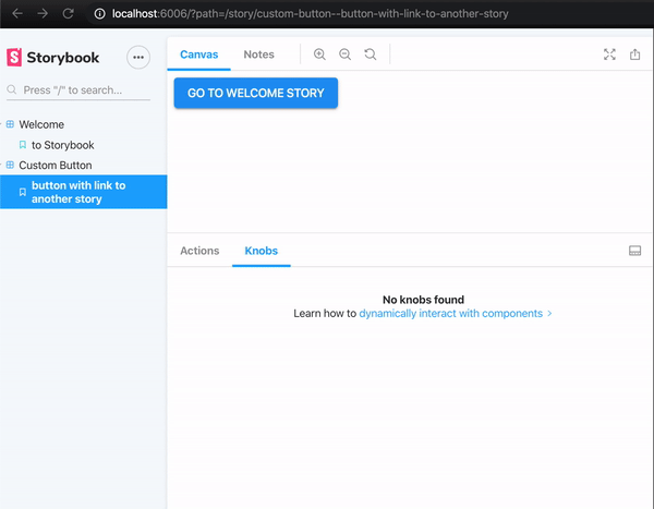
export const ButtonWithLinkToAnotherStory = () => ({
component: ButtonComponent, //changing the component declaration here
name: 'button with link to another story',
props: {
text: 'Go to Welcome Story',
onClickTask: linkTo('Welcome'), // redirecting to Welcome story
},
});After saving, you should see:
Knobs
Let’s create more advanced case for ButtonComponent story with knobs. Storybook Knobs add-on allows you to edit props dynamically using the Storybook UI. You can also use Knobs as a dynamic variable inside stories in Storybook.
There are many types of knobs, such as: text, boolean, number, color, object, array, select, etc.
More info about available knobs can be found here:
https://www.npmjs.com/package/@storybook/addon-knobs
First, knobs needs to be installed into application: npm i @storybook/addon-knobs
within .storybook/main.js:
module.exports = {
  addons: ['@storybook/addon-knobs/register']
}
Let’s go back to Button.stories.ts and add a decorator into our default story:
export default {
  title: 'Button',
  component: ButtonComponent,
  decorators: [withKnobs]
};
It tells us some knobs can be added to component. We can now add some knobs into project as a separate story item:
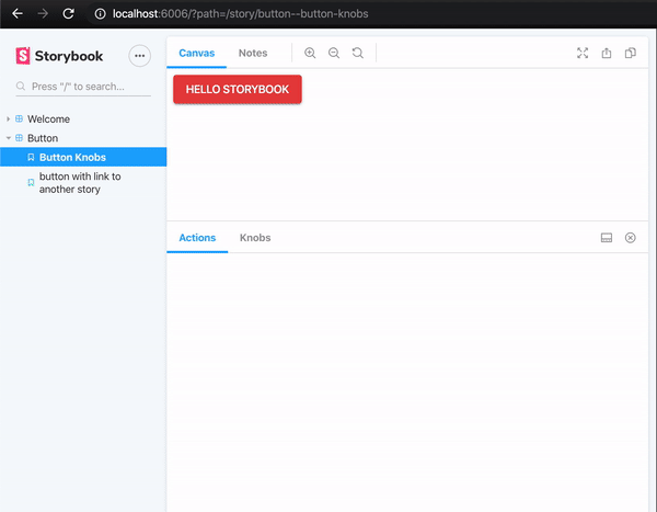
export const ButtonKnobs = () => ({
  component: ButtonComponent,
  name: 'Button Knobs', // name of our story case
  props: {
    text: text('text', 'Hello Storybook'), // we are able to change text inside button component
    color: color('color label', '#e74141'), // we are able to change background color inside button component
    disabled: boolean('should be disabled', false), // we are able disable button component
    onClickTask: e => { // handling click event
      e.preventDefault();
      action('log')(e.target);
    }
  },
});
Do not forget to import all necessary dependencies.
src/stories/Button.stories.ts
import {action} from '@storybook/addon-actions';
import {linkTo} from '@storybook/addon-links';

import {ButtonComponent} from '../app/button/button.component';
import {boolean, color, text, withKnobs} from '@storybook/addon-knobs';

export default {
  title: 'Button',
  component: ButtonComponent,
  decorators: [withKnobs]
};

export const ButtonKnobs = () => ({
  component: ButtonComponent,
  name: 'Button Knobs', // name of our story case
  props: {
    text: text('text', 'Hello Storybook'), // we are able to change text inside button component
    color: color('color label', '#e74141'), // we are able to change background color inside button component
    disabled: boolean('should be disabled', false), // we are able disable button component
    onClickTask: e => { // handling click event
      e.preventDefault();
      action('log')(e.target);
    }
  },
});

export const ButtonWithLinkToAnotherStory = () => ({
  component: ButtonComponent,
  props: {
    text: 'Go to Welcome Story',
    onClickTask: linkTo('Welcome'),
  },
});

ButtonWithLinkToAnotherStory.story = {
  name: 'button with link to another story',
};
After saving, you should receive:
We’ve got some basic story cases for ButtonComponent !
Composition
To speed up development, whole views can be created in Storybook. In case of this example, AppComponent consists of ButtonComponent and InputComponent:
src/app.component.html
<app-input name="login" type="text"></app-input>
<app-input name="password" type="password"></app-input>
<app-button text="Login"></app-button>
src/input/input.component.ts
import {Component, Input} from '@angular/core';

@Component({
  selector: 'app-input',
  template: `
    <article>
      <div class="material-input">
        <input type="{{type}}" required="">
        <label>{{name}}</label><span></span>
      </div>
    </article>
  `,
  styleUrls: ['./input.component.css']
})
export class InputComponent {
  @Input() name: string;
  @Input() type: string;
}
Let’s write a story which will show the whole view of AppComponent.
Create a Combined.stories.ts file inside src/stories. Same as before, module needs to be defined, with some additional info:
import {AppComponent} from '../app/app.component';
import {moduleMetadata} from '@storybook/angular';
import {InputComponent} from '../app/input/input.component';
import {ButtonComponent} from '../app/button/button.component';
import {CommonModule} from '@angular/common';

export default {
  title: 'Combined',
  decorators: [
    moduleMetadata({
        // imports both components to allow component composition with storybook
      declarations: [AppComponent, InputComponent, ButtonComponent],
      imports: [CommonModule]
    }),
  ],
};

export const AppComponentView = () => ({
  component: AppComponent,
  props: {},
});
moduleMetadata allows us to create component composition inside our stories, more information available at:
https://www.learnstorybook.com/intro-to-storybook/angular/en/composite-component/

Wrap up
The article is just a simple introduction into Storybook’s capabilities. There’s a huge variety of use cases that can be covered with it.
I would like to encourage you to use Storybook in your project. A well-written, extensive documentation is always the perfect way to create scalable, error-proof projects 🙂
Poznaj mageek of j‑labs i daj się zadziwić, jak może wyglądać praca z j‑People!
Skontaktuj się z nami


